Lucas Yu
creative director | art director
Castello Water
Unexpected
Castello asked us to bring the brand back after twenty years of silence. As one of Portugal’s best-known names, it needed a fresh start that respected its roots while making it feel current again. The challenge was to give a classic brand new relevance and help it reclaim its place in everyday culture.
Leo Burnett LX
AD: Gil Santos, Catarina Côrte-Real
DES: José Gouveia
CW: Freddie Brando, Hernani Correia
CD: Lucas Yu
ECD: Steve Colmar
IMG: Snowberry, Nuno Correia, Glimpse VFX, André Leite
CAMPAIGN STRATEGY
In a world of clichés, the unexpected.
While most waters are born in green and humid regions, Castello’s source lies in the heart of one of the driest parts of Portuguese Alentejo. A place where you’d never expect a water spring to exist. That striking uniqueness became the foundation of our strategy.
We embraced what makes Castello naturally different and turned it into a statement.
It’s not water. It’s Castello — a celebration of origin, authenticity, and the strength to thrive where others couldn’t.
VISUAL IDENTITY
Rooted in the unexpected.
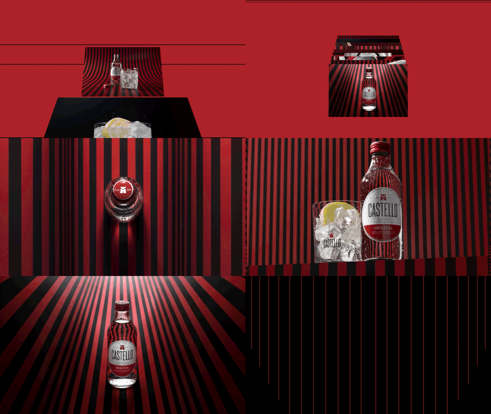
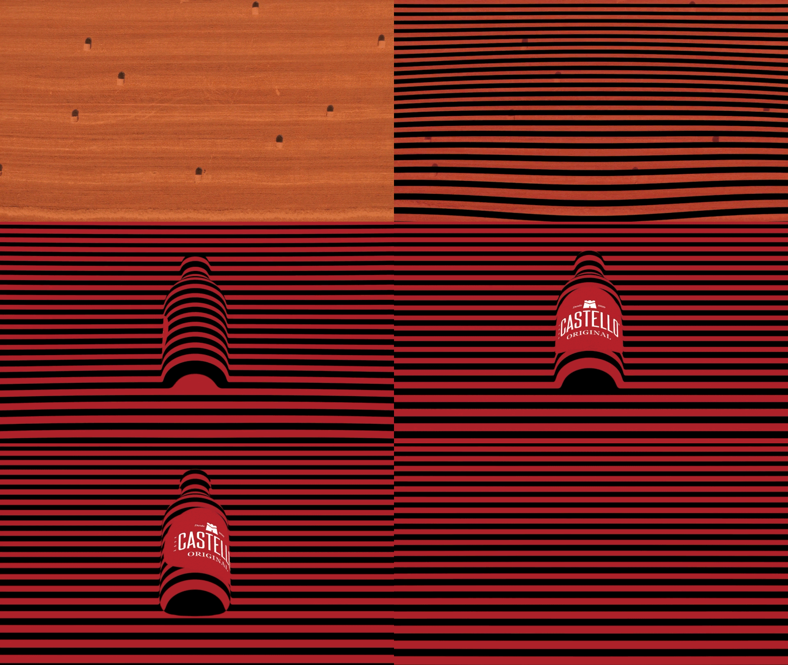
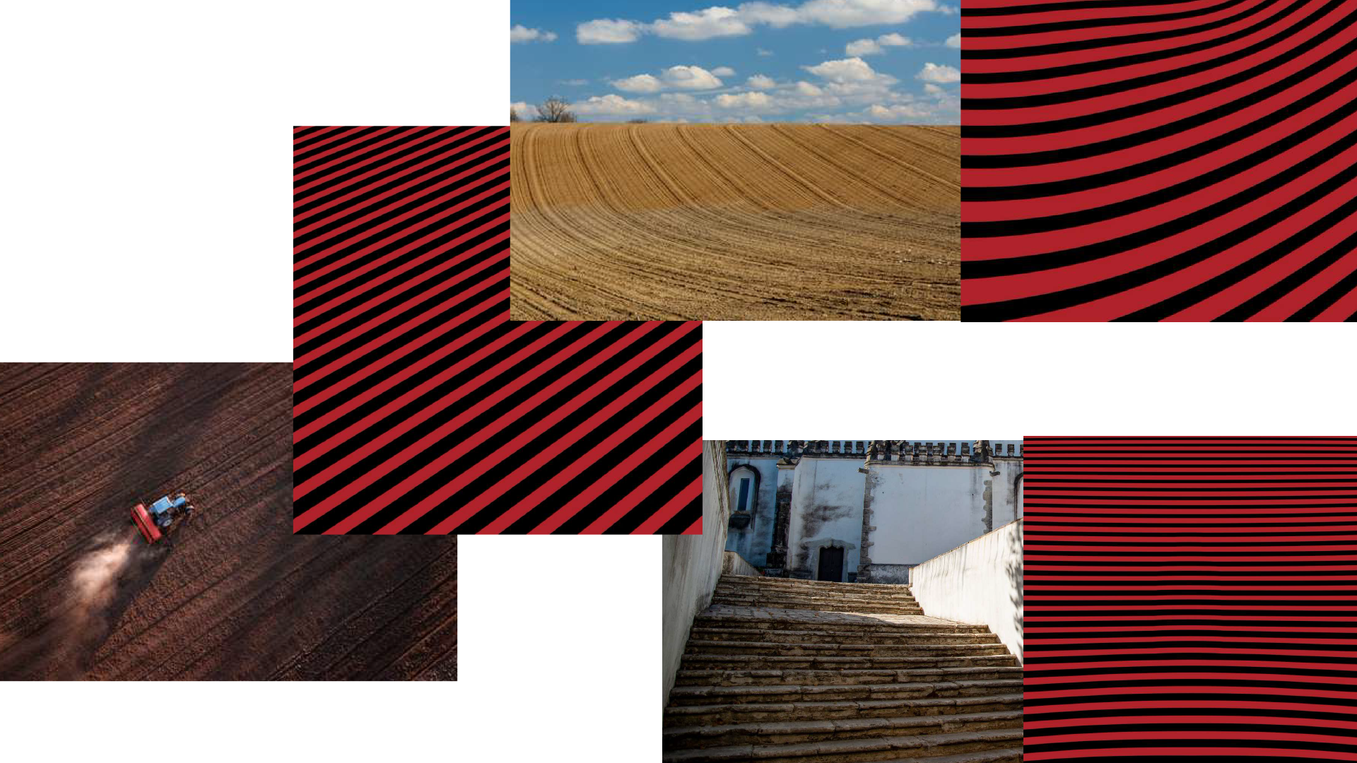
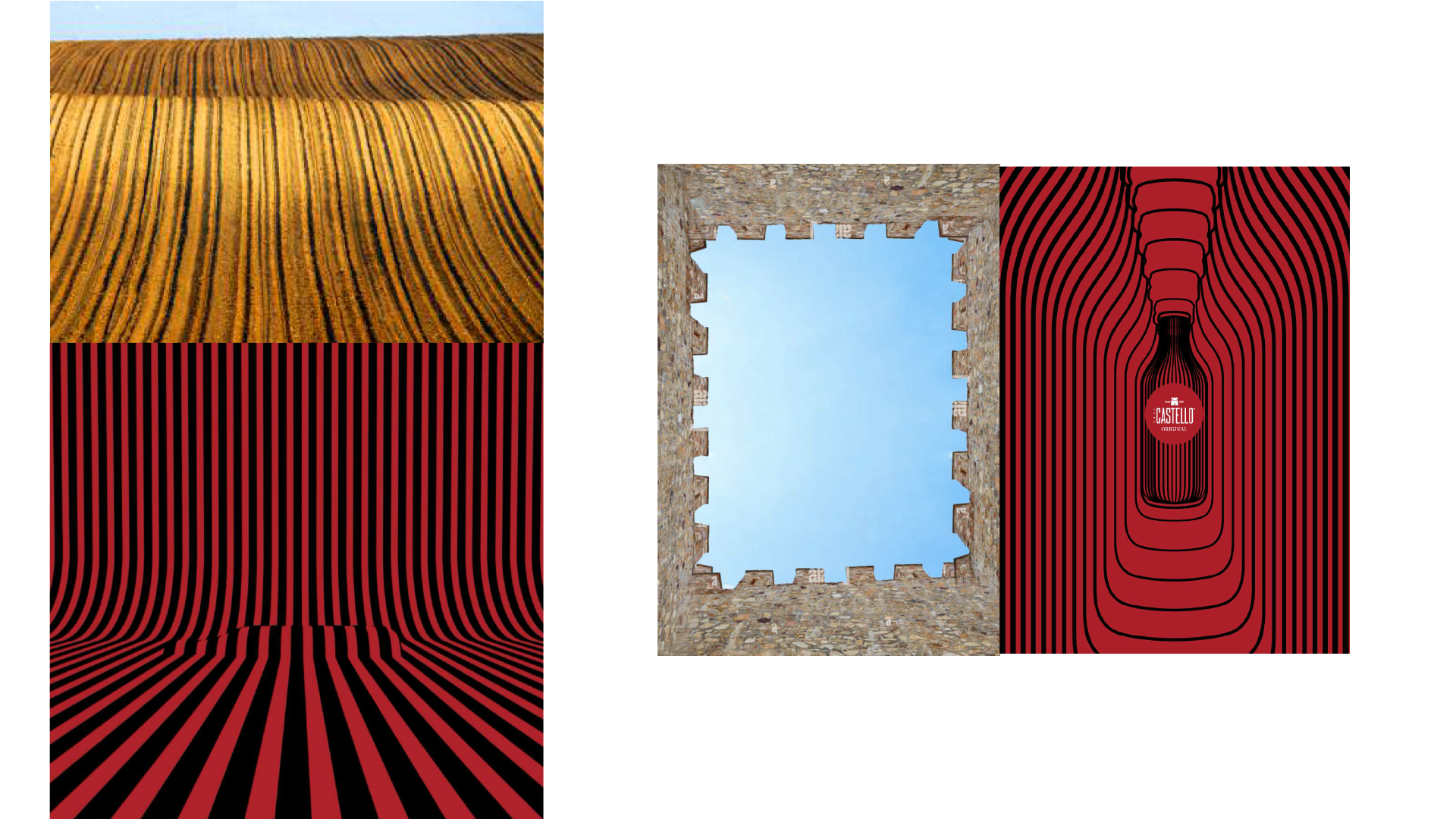
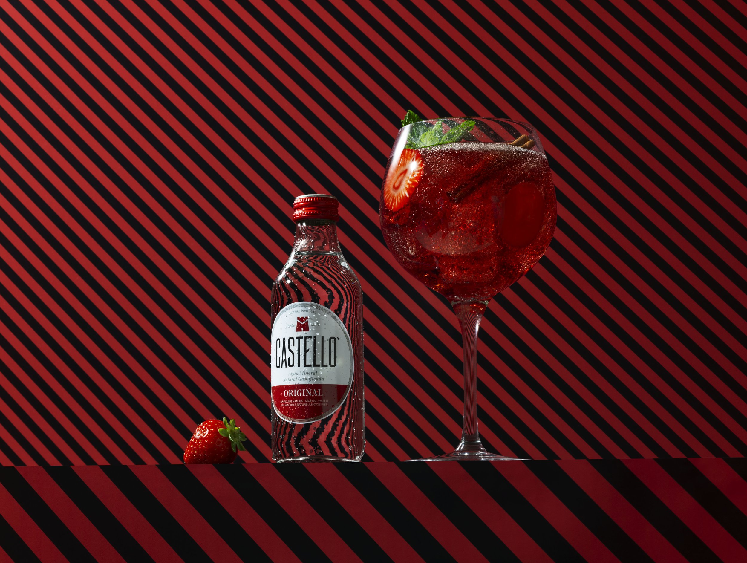
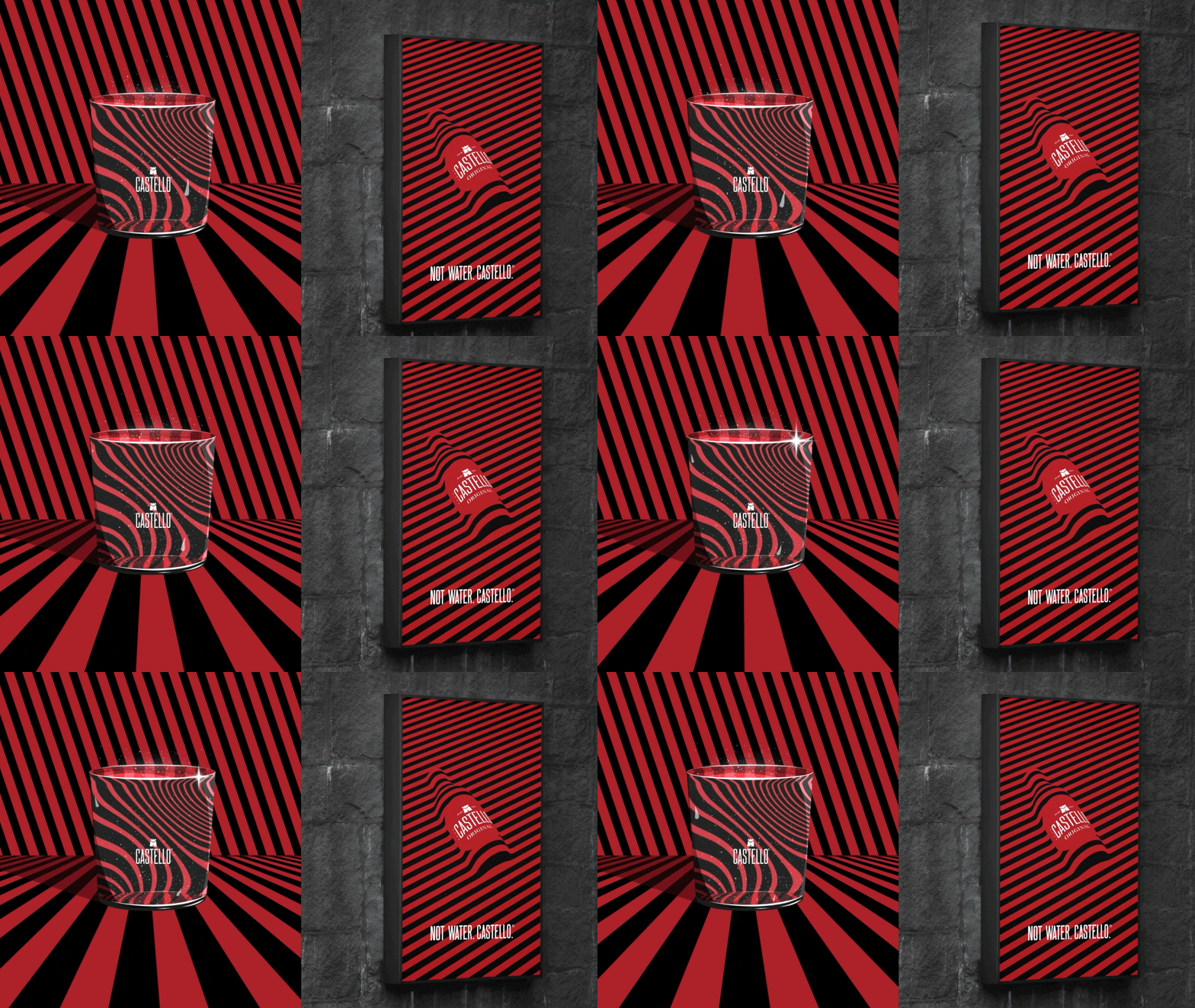
For Castello’s first redesign in years, we went back to where it all started: the dry, sunlit land that births the water. The contrasts found there inspired the new look, from the rugged Alentejo landscapes to the lines found in Moura’s castle.
Rough textures became simple shapes, and the color palette mixed warm earth tones with cool shadows. The result feels natural, confident, and unmistakably Castello.
PHOTOGRAPHY
Where difference takes shape.
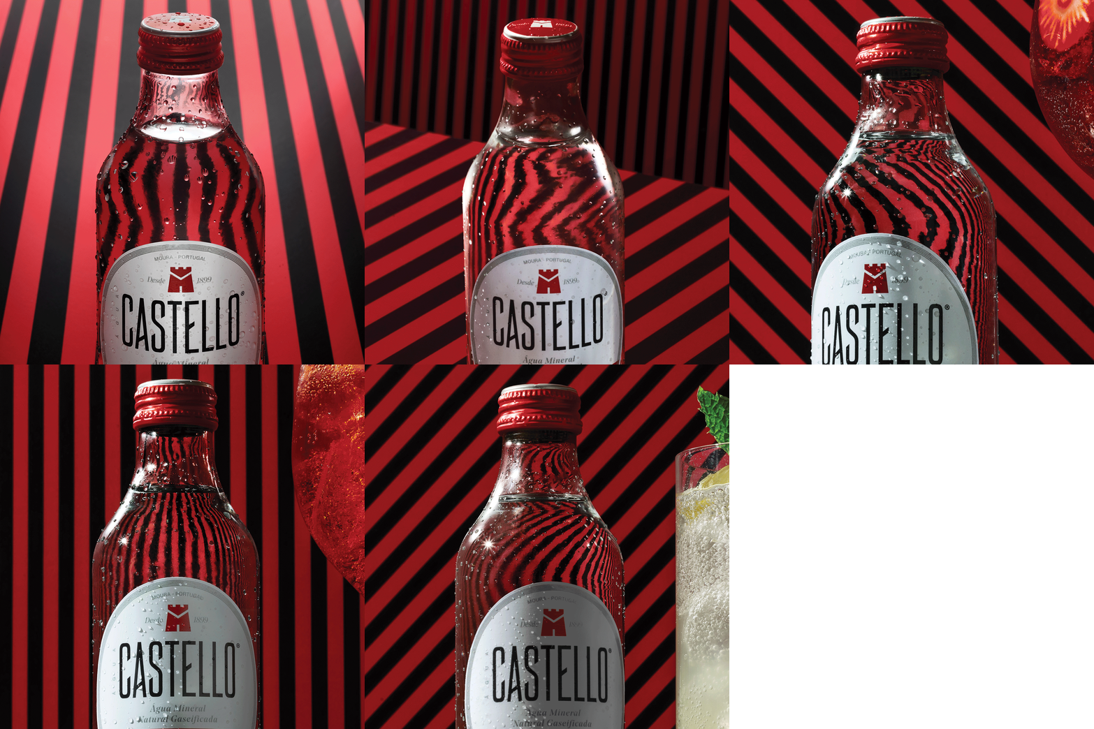
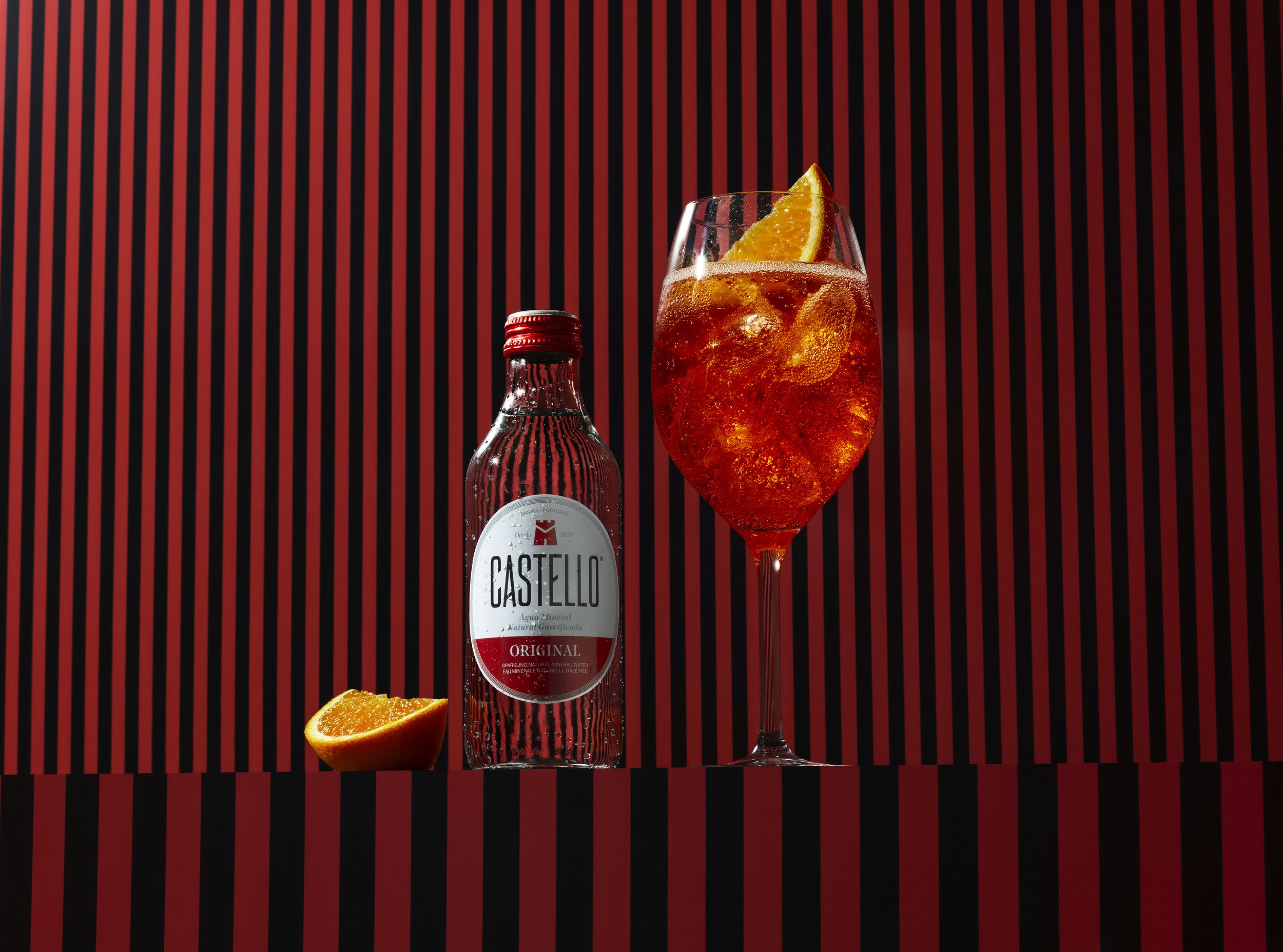
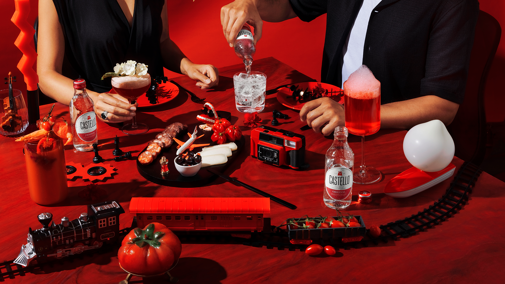
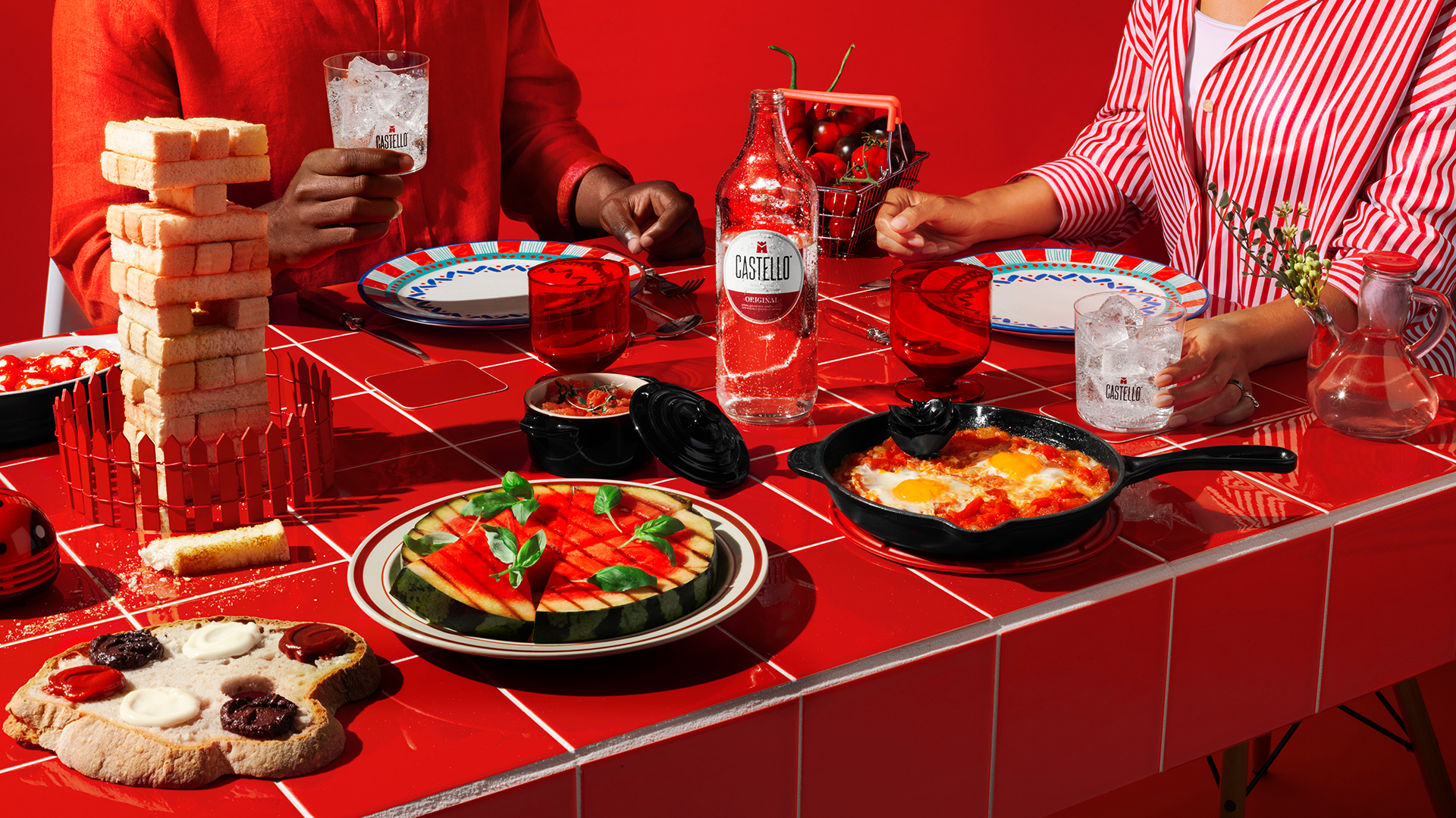
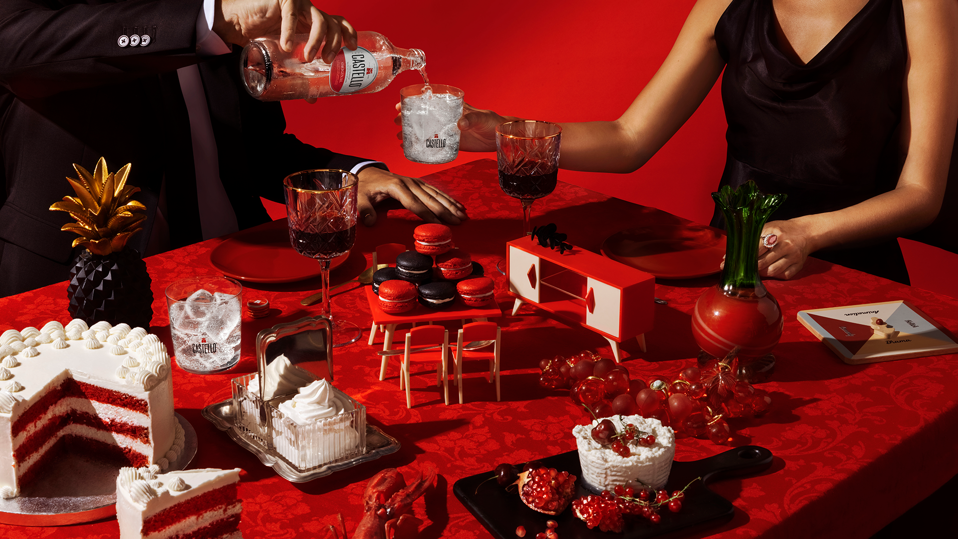
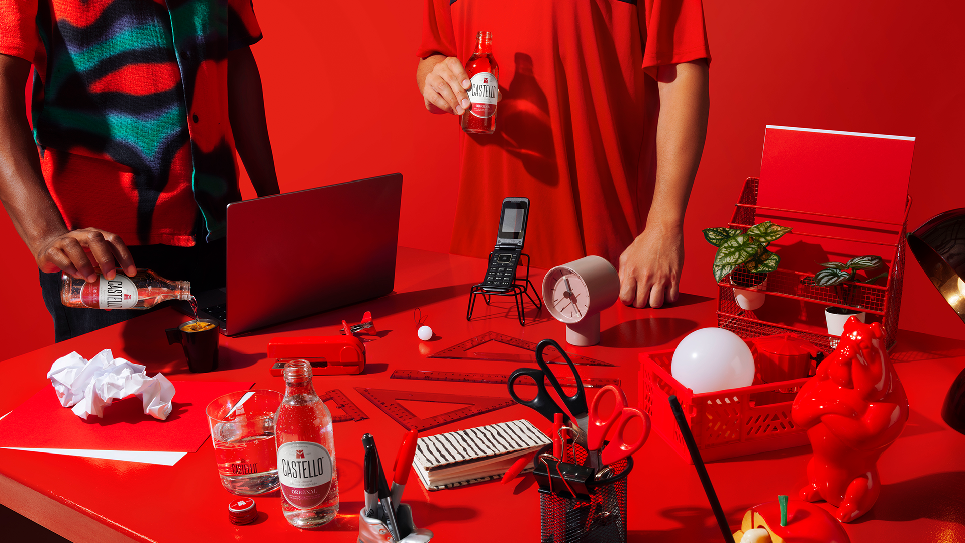
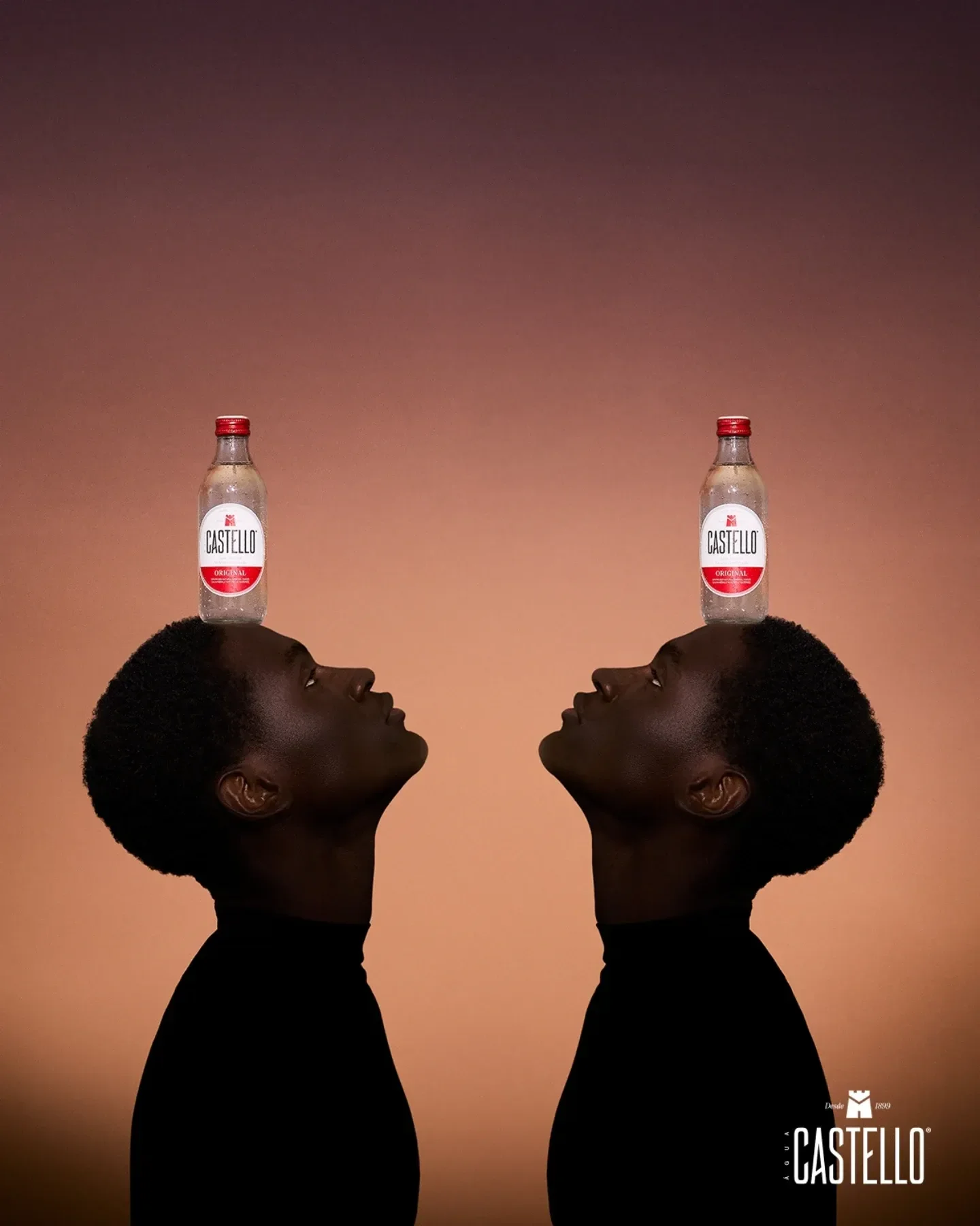
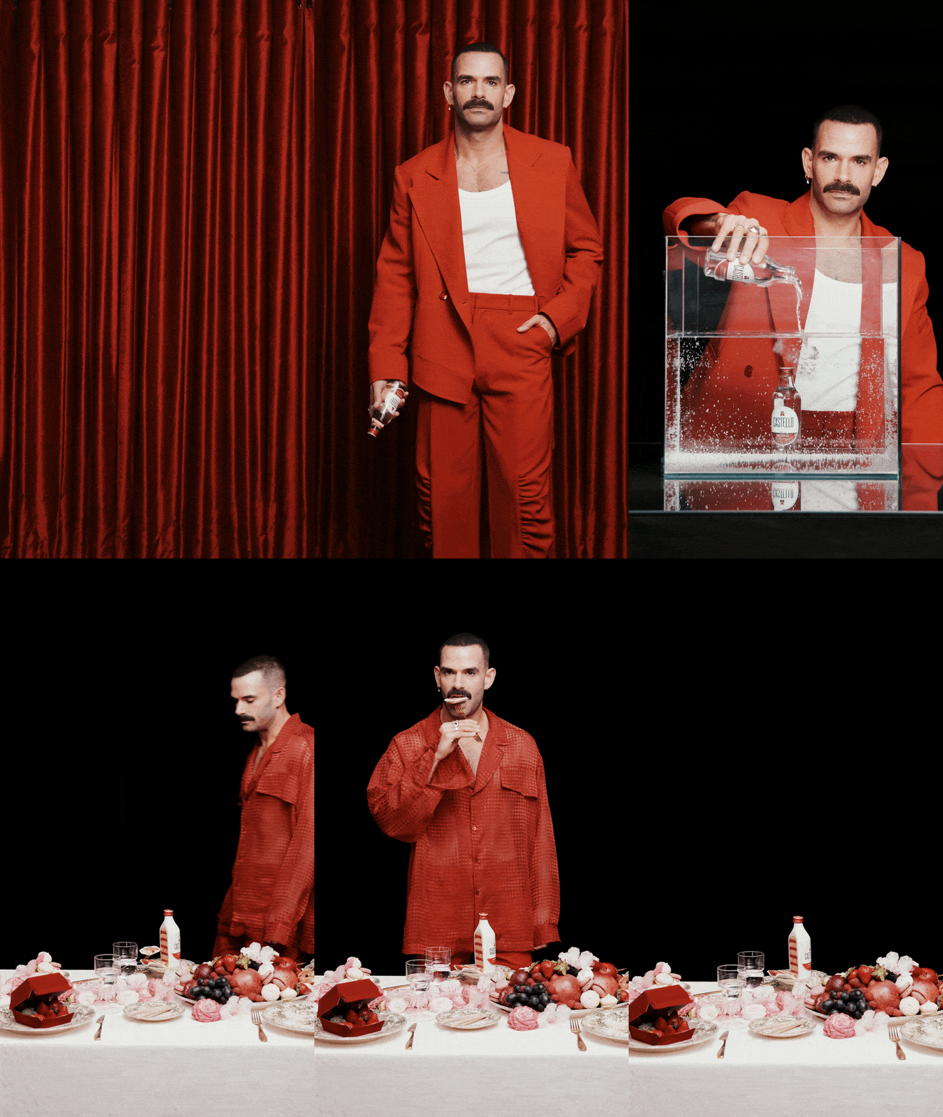
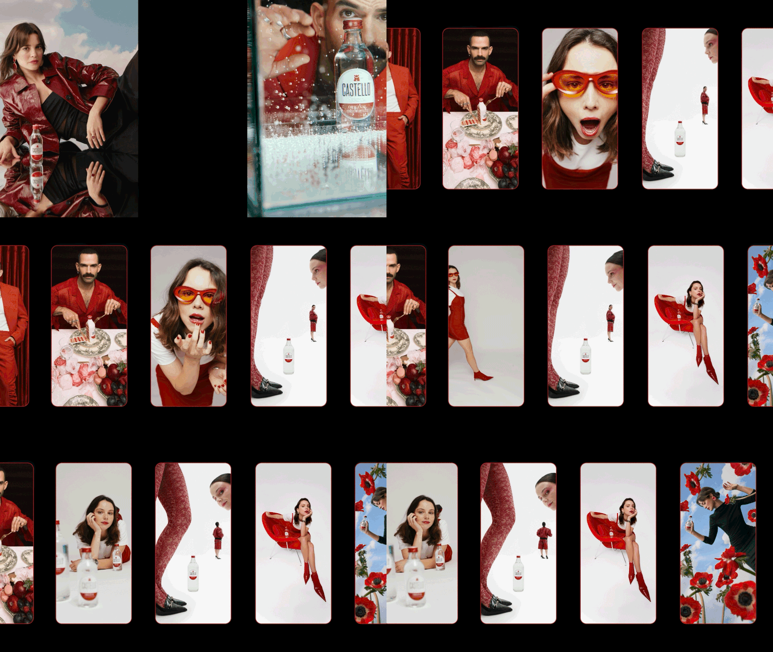
Instead of showing our origins literally, we focused on what it represents. The photography followed the same simple, structured style, shaped by light and contrast.
Each shot was built to feel strong on its own while fitting into a bigger story about individuality and honesty.
APPLICATION
Bringing it to life.
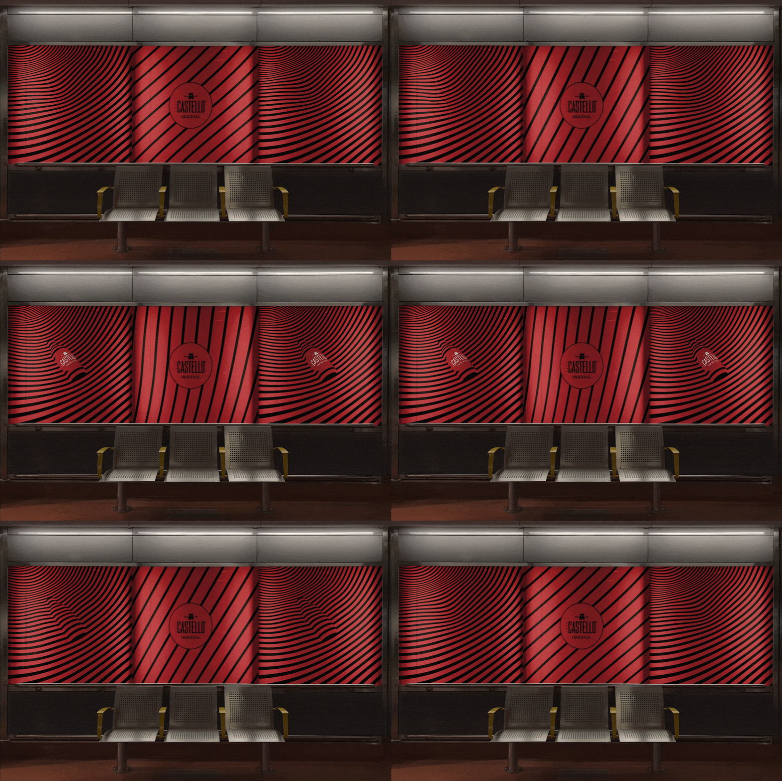
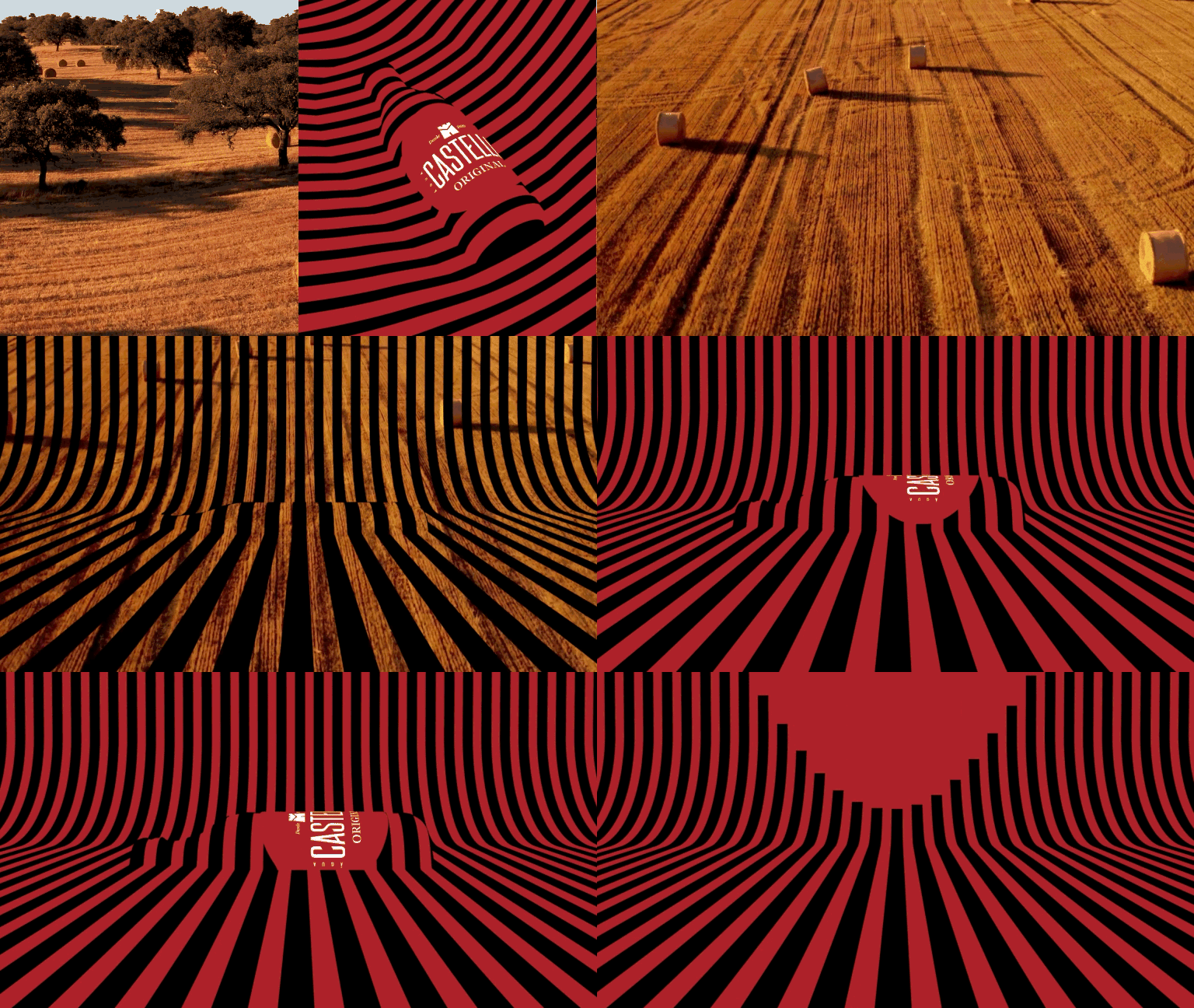
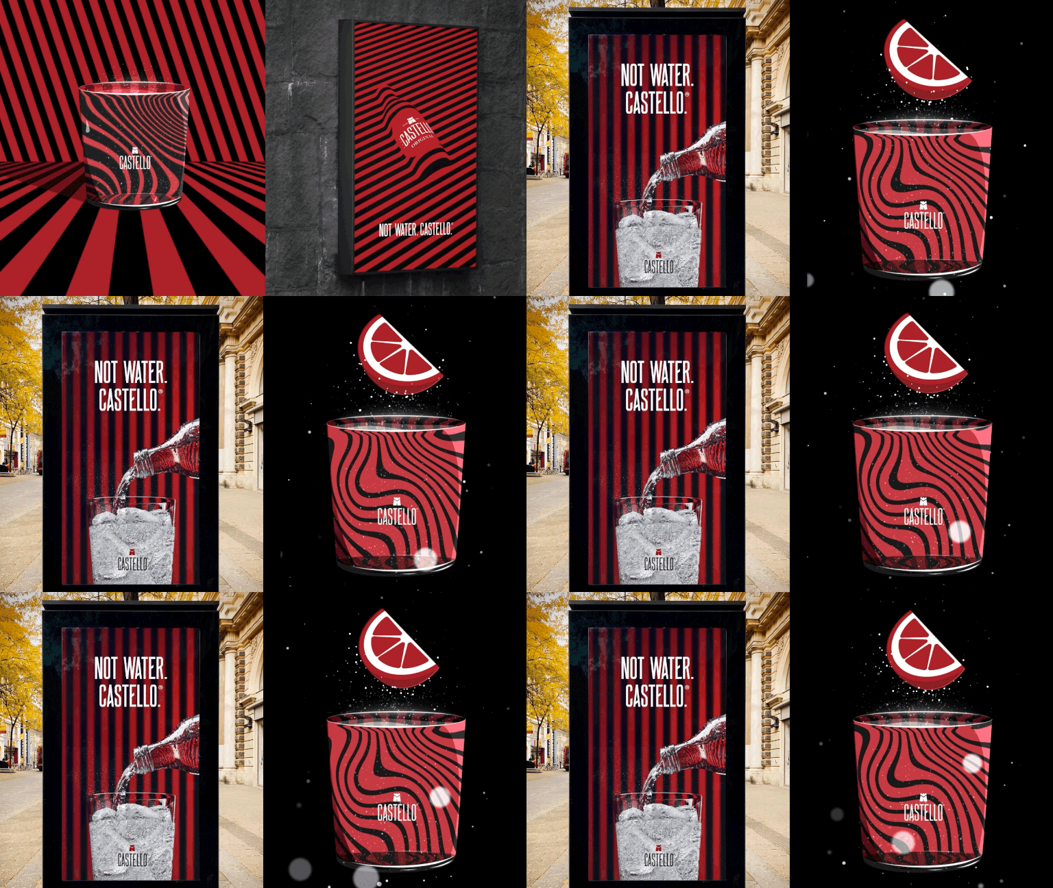
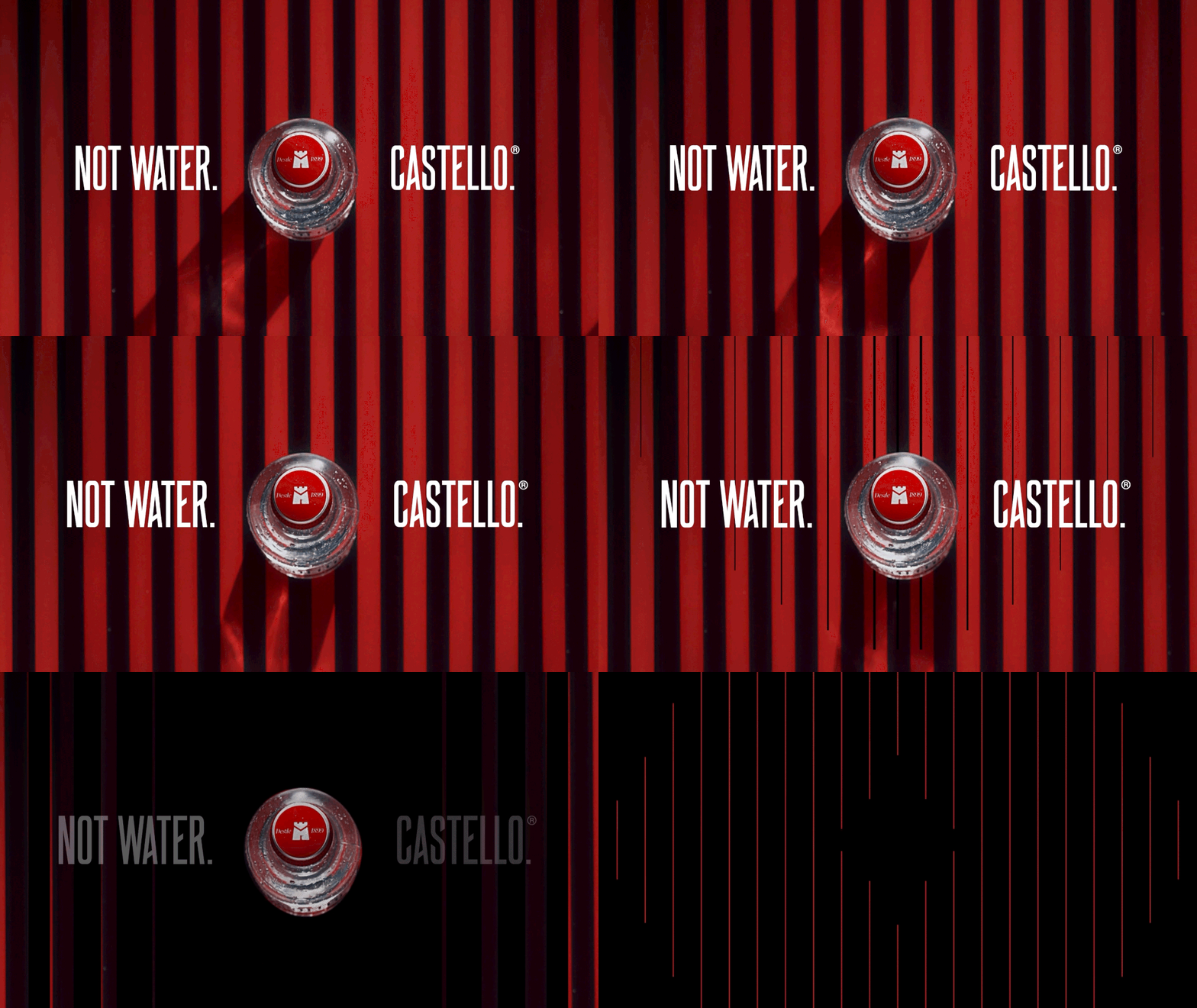
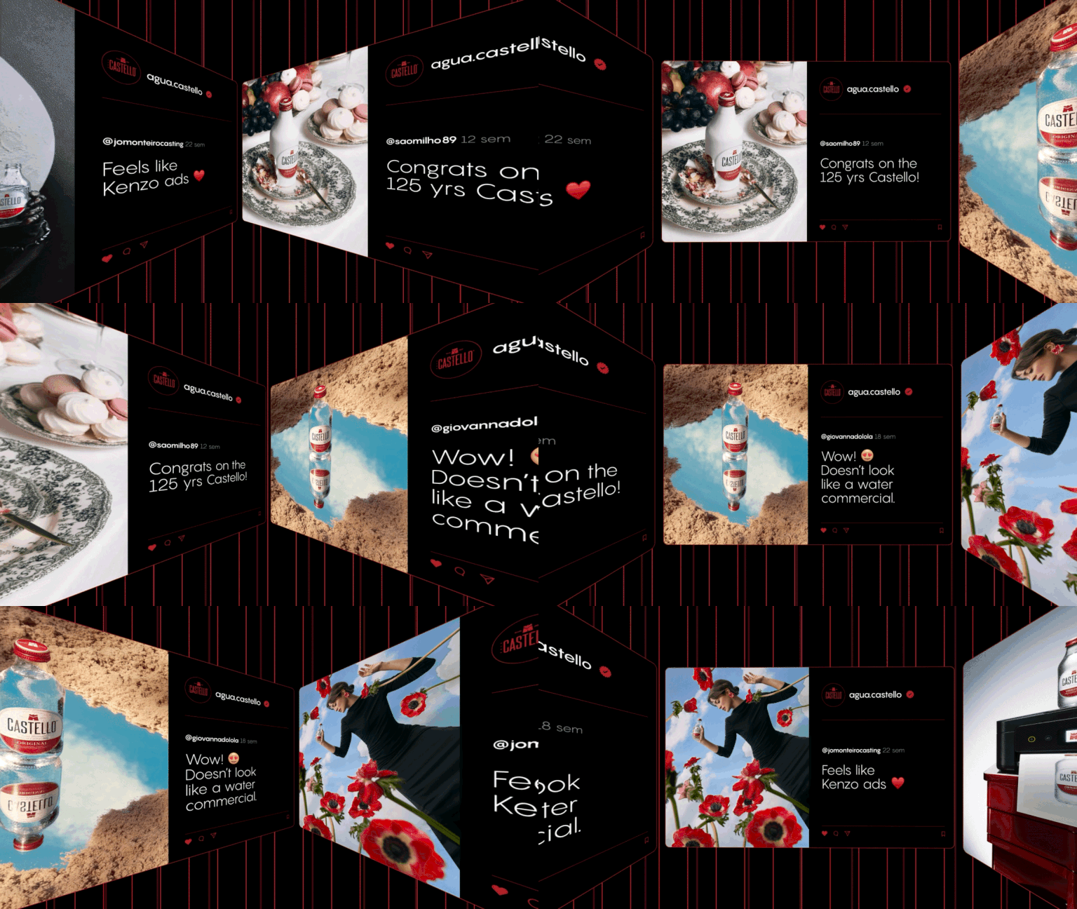
From film and outdoor ads to social media and print, every piece shared the same message: to embrace the unexpected. The warm colors, clean lines, and bold layouts gave Castello a new energy. Across every format, the brand now stands out with clarity and confidence. It’s more than water. It’s Castello.


